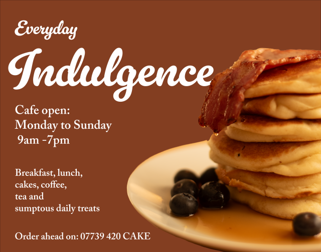
Using photos in graphic design
This is an example of where my interest in photography, food and graphic design came together!
Using photos in graphic design
This is an example of where my interest in photography, food and graphic design came together!
This is another thing that evolved out of figure drawing practice thanks to draw Brighton reference photos.
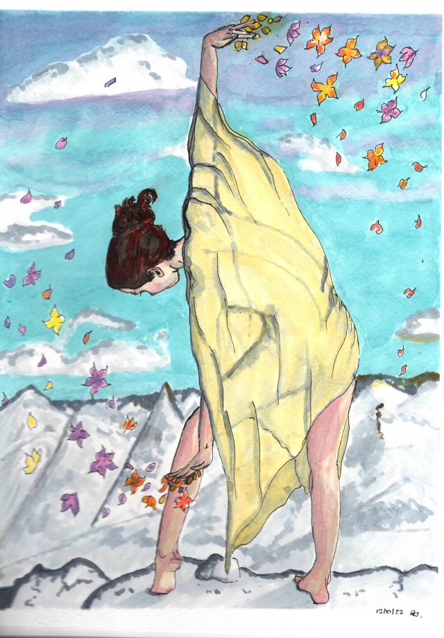
Another figure drawing practice piece. This time after the intial pencil sketch of the model, I decided to fill in the colours with promarkers. There are some real success’ here for me. The legs and feet I am particularly fond of. The background however somewhat losts it’s way. Like a poem that starts with a great first line and then struggles to maintain that impetus, that is what I found here, the figure was goodish and served the purpose of life drawing practice and I like the idea of the flowers. The background however is way too busy and the mountains less than successful. Thanks again to Draw Brighton for the reference.
Drawn using promarkers and finelines on watercolour paper.
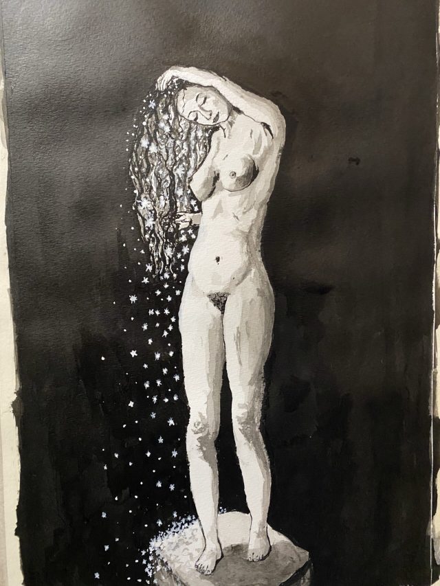
Started out as a figure drawing practice and evolved into this. Blackstar ink with brush on heavy watercolour paper. Laying down the ink is soooo satisfying.
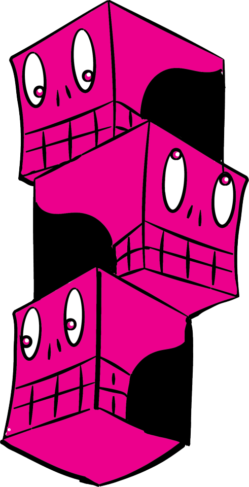
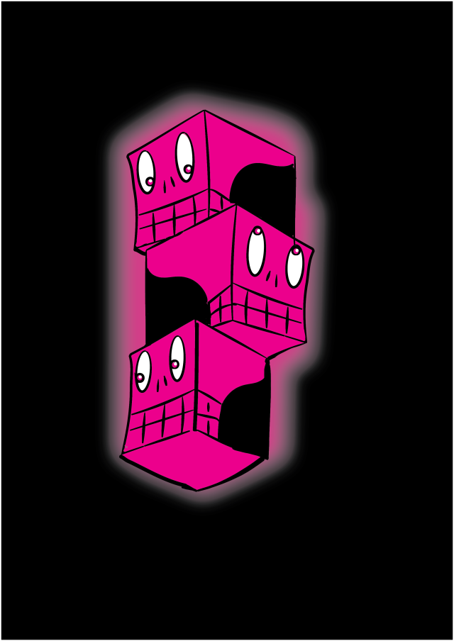
Is a thing that came to life in my sketchbook and has become a little bit of an obsession. I am not sure who/what they are or what they want from me but here they are in their most refined form.
don’t think we are done with these dudes there are many more ways they want to show up.
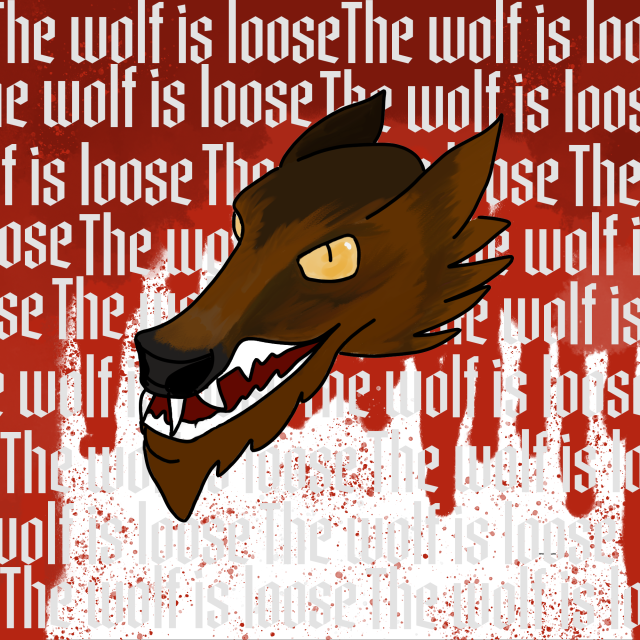
This one is mostly a result if me wanting to create something like Mike Stockings’s great tattoo artwork. He uses procreate on the iPad and I wanted to see if I could create something similar with Photoshop and a Wacom intuos. Here is the result. I had “The wolf is loose” by Mastodon going round in my head as I drew so this influenced the result as you can see!
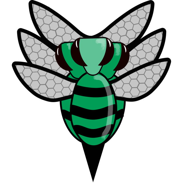
This was a fun one. We had many ideas from boars to bees. Eventually after a bit of iteration we ended up with this. Three bees, BBBL, geddit? I love a bit of humour in a design!
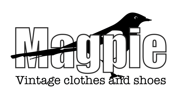
This is a logo for a fictional shop. The idea for this popped into my head while out on a dog walk one morning watching the magpies. I am a big fan of all the corvids.
This was a task that I did for the Creativity and Navigating Uncertainty course. Although the images are not the strongest, I enjoyed following a broad creative brief and executing in keeping with the three stages of the process;
This is not portfolio work by any means, but interesting to see how a piece of work can come together with just a small impetus and a few parameters.
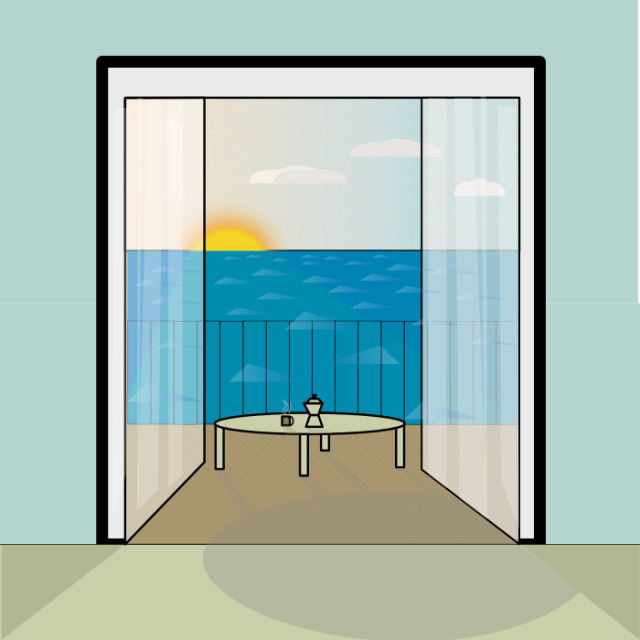
This is something a bit different. I had half a mind to do a daily “affinitober” vector drawing or similar. It took me too long to get something done and much harder to turn out something vaguely good in vector than a sketch. So this never happened but I did have an urge to finish this piece which is day 1 “morning” . I had been flicking through a book of airbrush art and I wanted to get that retro, airbrish feel but with vectors.
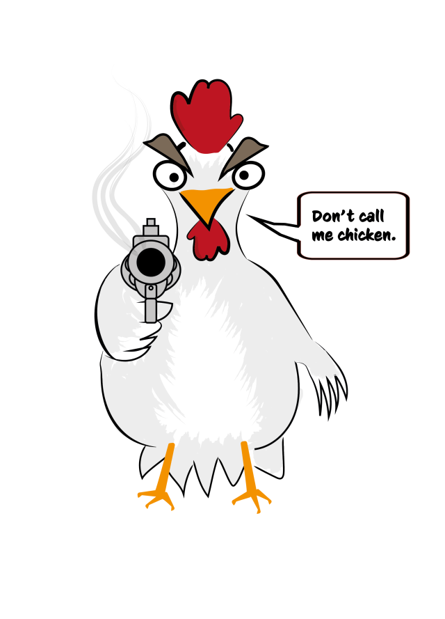
I did this Vector for a T-shirt design for my Brother-in-law. I work better if I have a deadline. Pretty happy with this guy. Also, do you spot the error I made with the chicken?
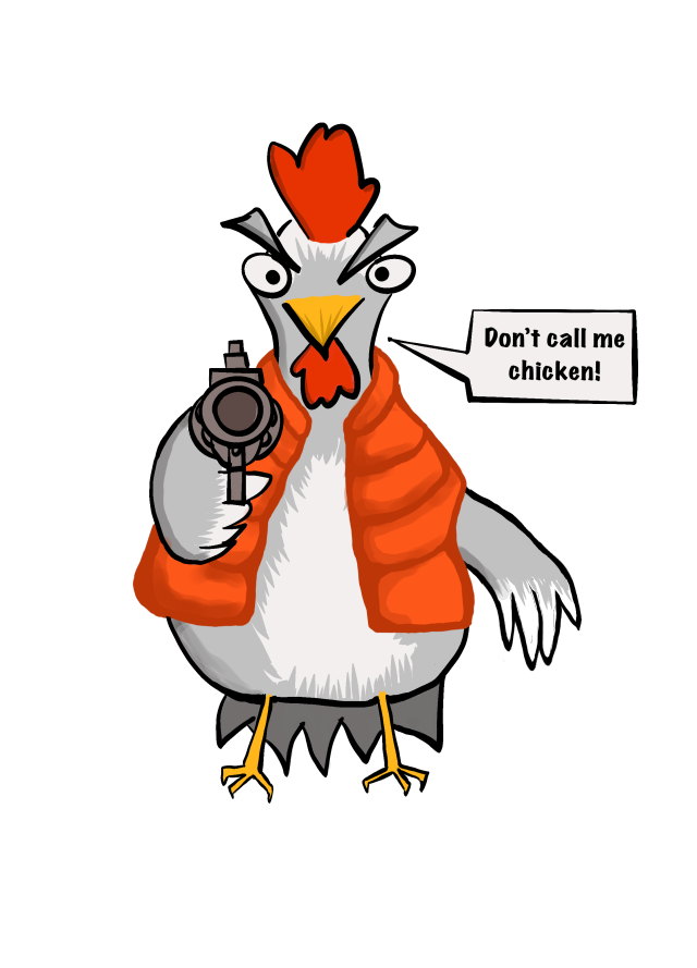
Below that you can see the iteration with the Back to the Future reference. This one I printed for my brother-in-law brother.